Parsing the LIVSN Color Palette
We don’t create new product types, color variants, or anything on a whim until we are sure it fits our brand identity and audience needs. Behind the scenes of new product and color expansion are hundreds—if not thousands—of small but important choices on everything from zipper types to trim patterns to ensure it makes sense to put into production.
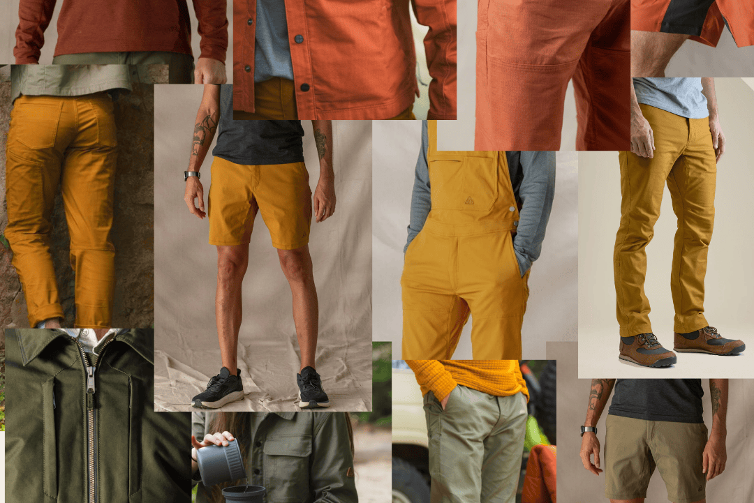
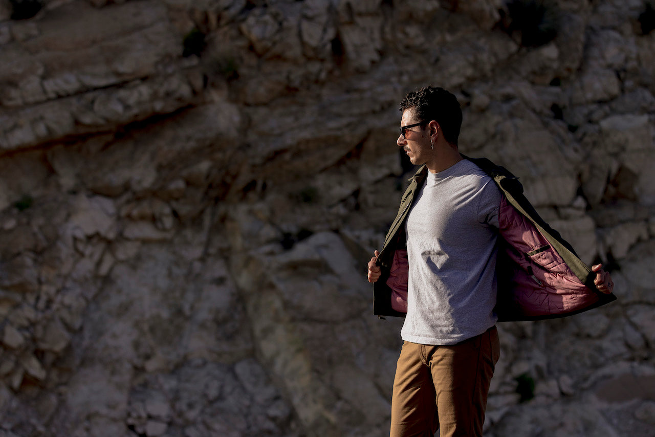
There’s perhaps no factor more immediately impactful about a piece than its color. Even if something fits ideally, if the color doesn’t do it for you, then there’s little to no chance it’ll end up in your closet. As LIVSN has grown, we’ve intentionally created a color palette that matches our brand’s priority of versatility set to last not just for seasons but years.
We sat down with our newest full-time staff member Abby Hollis to dive deep into the color palette of LIVSN and peel back the curtain about our development process.
Some Color Theory Basics
Before we dive into the our color development process, here’s a quick color theory refresher course that’s helpful when dealing with subtle nuances:
-
Hue
- The most basic shade or description of a color
- Can be defined as what combination of primary colors (red, blue, yellow) creates it
-
Value
- How light or dark the hue is presented
- Often controlled by adding white to increase/lighten value or black to decrease/darken it
-
Saturation
- The strength or vibrancy of the color
- High saturation creates bold, vivid colors
- Low saturation creates a more muted tone
- Saturation is typically affected by adding grey to hue and value
What LIVSN Looks for in a Color
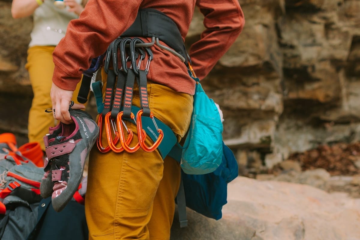
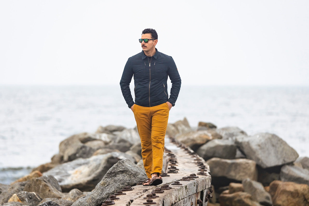
“We pick initial hues that are classic but eye-catching,” Hollis explains. “The LIVSN color palette centers on interesting earth tones. We use the word dusty, which means loud-ish earth tone but desaturated.”
Niche color palettes like dusty start to make more sense after seeing several examples of them across different hues. These contrast with brighter or more poppy colors, and there's a good reason for this choice.
“Crazy pants color don’t get as much use, fall out of favor faster, and typically don’t pair as well with other pieces,” Hollis continues. “We’re always trying to pick colors to get people excited but are also versatile so people use them frequently and for a long time.”
Vibrant colors do still appear within LIVSN product interiors, trims, and more, but for now, a wider usage window takes top priority over making a strong initial visual splash.
From Pantone Book to End Product
The process of creating a new piece of apparel requires years of development, dozens of prototypes, and more than a fair bit of trial and error, especially when it comes to color swatches.
It all begins with the almighty pantone Book—considered the color dictionary for design and print —where initial choices are made and then further refined.
“We usually start with around three or four ‘color concepts’ for a piece and then we pick two or three individual pantones for each of those categories. ” Hollis says. “We then send those selections off to get fabric dipped, as every fabric will take the dye differently, which then comes back on a little swatch.”
From the dozen or so color swatches produced, only two to three typically go into production and end up being available to the public. New color additions are added slowly, at most one per piece a year, and there’s a strategy behind this incremental rollout.
“We think about how colors might look on a shelf at a retailer or in our store,” Hollis says. “We wouldn’t do two blues with the same piece within a season, even if they were quite different shades. Typically, we try to make one more neutral choice and then a funky one.”

How We Introduce New Product Types and Colors
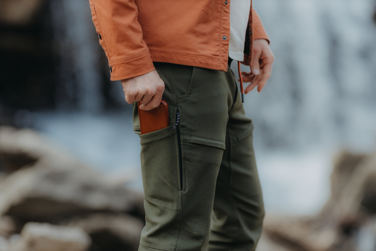
As LIVSN has expanded not just our colors but product types, creating a cohesive color palette across pieces has become a more complicated affair. Versatility has long been a LIVSN brand cornerstone for product usage, and this mindset has been embedded within the color choices we offer as well.
“Now that we are making more tops, versatility within a color has definitely become a top priority so pieces pair well within our own product line and outside it as well,” Hollis says. “We want to make clothing people can wear in as many ways as possible. A capsule closet model.”
Having a flexible, interchangeable wardrobe gives owners more outfit options with less clothing. Colors that play well with one another take time to find and implement within our product line and with everyday pieces most people already own.
LIVSN also takes into account what our audience directly tells us in terms of color preferences. Such was the case with the addition of the new navy option of the Flex Canvas Pants, which replaced the pure black of previous years.
“A lot of people asked about the navy, specifically from the service industry world, so that was a consideration,” Hollis explains. “It’s also just a nice classic color but a little softer than the black. Our palette is pretty soft and earth vibes, the black felt a little harsh. The navy checks the box for what we look for with new colors, and I’d describe it as dark, inky, and black-adjacent.”
Future Possibilities for the LIVSN Palette
While the LIVSN product line has its core identity, it’s an ongoing process from season to season about what colors to keep and what to try. When asked about what colors to expect on products still deep in the production and design process, Hollis had this to say:
“Colors that are familiar enough that they don't scare people while having some unique quality to them, like the upcoming plum truffle we have in the works for Spring of 2024. Colors that are hard to name are usually the ones we like. If we don’t know how to define a color, that’s a good sign.”
Is there a curveball color you’d love to see on your favorite LIVSN piece down the line?
Drop a comment below or message us directly about what you’d like to see, and we’ll see what we can do to work it into our ever-evolving color palette.


2 comments
Would like to see the brown option for more of your pants. They work best on the trail. Don’t like the caramel at all.
dean
I have a pair of gray pants with the tag…. 122ECO Bulk I love the light weight flexible material. Is the new navy blue pant on this email the same material and fit because it says flex ‘canvas’ which I think is heavier? Thanks
Brian Smith
Leave a comment
This site is protected by hCaptcha and the hCaptcha Privacy Policy and Terms of Service apply.